scipy.stats.yeojohnson_llf
-
scipy.stats.yeojohnson_llf(lmb, data)[source]¶ The yeojohnson log-likelihood function.
- Parameters
- lmbscalar
Parameter for Yeo-Johnson transformation. See
yeojohnsonfor details.- dataarray_like
Data to calculate Yeo-Johnson log-likelihood for. If data is multi-dimensional, the log-likelihood is calculated along the first axis.
- Returns
- llffloat
Yeo-Johnson log-likelihood of data given lmb.
See also
Notes
The Yeo-Johnson log-likelihood function is defined here as
\[llf = N/2 \log(\hat{\sigma}^2) + (\lambda - 1) \sum_i \text{ sign }(x_i)\log(|x_i| + 1)\]where \(\hat{\sigma}^2\) is estimated variance of the the Yeo-Johnson transformed input data
x.New in version 1.2.0.
Examples
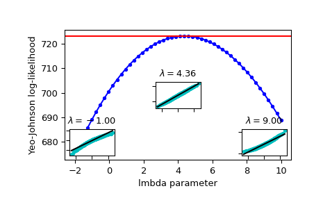
>>> from scipy import stats
>>> import matplotlib.pyplot as plt
>>> from mpl_toolkits.axes_grid1.inset_locator import inset_axes
>>> np.random.seed(1245)
Generate some random variates and calculate Yeo-Johnson log-likelihood values for them for a range of
lmbdavalues:>>> x = stats.loggamma.rvs(5, loc=10, size=1000) >>> lmbdas = np.linspace(-2, 10) >>> llf = np.zeros(lmbdas.shape, dtype=float) >>> for ii, lmbda in enumerate(lmbdas): ... llf[ii] = stats.yeojohnson_llf(lmbda, x)
Also find the optimal lmbda value with
yeojohnson:>>> x_most_normal, lmbda_optimal = stats.yeojohnson(x)
Plot the log-likelihood as function of lmbda. Add the optimal lmbda as a horizontal line to check that that’s really the optimum:
>>> fig = plt.figure()
>>> ax = fig.add_subplot(111)
>>> ax.plot(lmbdas, llf, 'b.-')
>>> ax.axhline(stats.yeojohnson_llf(lmbda_optimal, x), color='r')
>>> ax.set_xlabel('lmbda parameter')
>>> ax.set_ylabel('Yeo-Johnson log-likelihood')
Now add some probability plots to show that where the log-likelihood is maximized the data transformed with
yeojohnsonlooks closest to normal:>>> locs = [3, 10, 4] # 'lower left', 'center', 'lower right' >>> for lmbda, loc in zip([-1, lmbda_optimal, 9], locs): ... xt = stats.yeojohnson(x, lmbda=lmbda) ... (osm, osr), (slope, intercept, r_sq) = stats.probplot(xt) ... ax_inset = inset_axes(ax, width="20%", height="20%", loc=loc) ... ax_inset.plot(osm, osr, 'c.', osm, slope*osm + intercept, 'k-') ... ax_inset.set_xticklabels([]) ... ax_inset.set_yticklabels([]) ... ax_inset.set_title(r'$\lambda=%1.2f$' % lmbda)
>>> plt.show()