scipy.stats.probplot
- scipy.stats.probplot(x, sparams=(), dist='norm', fit=True, plot=None, rvalue=False)[source]
Calculate quantiles for a probability plot, and optionally show the plot.
Generates a probability plot of sample data against the quantiles of a specified theoretical distribution (the normal distribution by default). probplot optionally calculates a best-fit line for the data and plots the results using Matplotlib or a given plot function.
Parameters: x : array_like
Sample/response data from which probplot creates the plot.
sparams : tuple, optional
Distribution-specific shape parameters (shape parameters plus location and scale).
dist : str or stats.distributions instance, optional
Distribution or distribution function name. The default is ‘norm’ for a normal probability plot. Objects that look enough like a stats.distributions instance (i.e. they have a ppf method) are also accepted.
fit : bool, optional
Fit a least-squares regression (best-fit) line to the sample data if True (default).
plot : object, optional
If given, plots the quantiles and least squares fit. plot is an object that has to have methods “plot” and “text”. The matplotlib.pyplot module or a Matplotlib Axes object can be used, or a custom object with the same methods. Default is None, which means that no plot is created.
Returns: (osm, osr) : tuple of ndarrays
Tuple of theoretical quantiles (osm, or order statistic medians) and ordered responses (osr). osr is simply sorted input x. For details on how osm is calculated see the Notes section.
(slope, intercept, r) : tuple of floats, optional
Tuple containing the result of the least-squares fit, if that is performed by probplot. r is the square root of the coefficient of determination. If fit=False and plot=None, this tuple is not returned.
Notes
Even if plot is given, the figure is not shown or saved by probplot; plt.show() or plt.savefig('figname.png') should be used after calling probplot.
probplot generates a probability plot, which should not be confused with a Q-Q or a P-P plot. Statsmodels has more extensive functionality of this type, see statsmodels.api.ProbPlot.
The formula used for the theoretical quantiles (horizontal axis of the probability plot) is Filliben’s estimate:
quantiles = dist.ppf(val), for

        0.5**(1/n),                  for i = n
  val = (i - 0.3175) / (n + 0.365),  for i = 2, ..., n-1
        1 - 0.5**(1/n),              for i = 1
where i indicates the i-th ordered value and n is the total number of values.
Examples
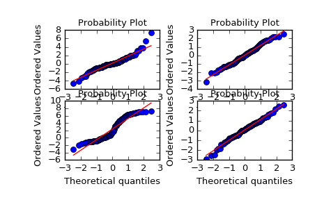
>>> from scipy import stats
>>> import matplotlib.pyplot as plt
>>> nsample = 100
>>> np.random.seed(7654321)
A t distribution with small degrees of freedom:
>>> ax1 = plt.subplot(221)
>>> x = stats.t.rvs(3, size=nsample)
>>> res = stats.probplot(x, plot=plt)
A t distribution with larger degrees of freedom:
>>> ax2 = plt.subplot(222)
>>> x = stats.t.rvs(25, size=nsample)
>>> res = stats.probplot(x, plot=plt)
A mixture of two normal distributions with broadcasting:
>>> ax3 = plt.subplot(223)
>>> x = stats.norm.rvs(loc=[0,5], scale=[1,1.5],
...                    size=(nsample//2,2)).ravel()
>>> res = stats.probplot(x, plot=plt)
A standard normal distribution:
>>> ax4 = plt.subplot(224)
>>> x = stats.norm.rvs(loc=0, scale=1, size=nsample)
>>> res = stats.probplot(x, plot=plt)
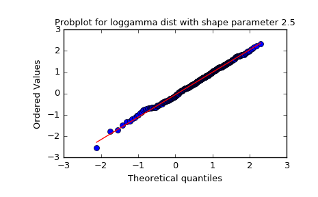
Produce a new figure with a loggamma distribution, using the dist and sparams keywords:
>>> fig = plt.figure()
>>> ax = fig.add_subplot(111)
>>> x = stats.loggamma.rvs(c=2.5, size=500)
>>> res = stats.probplot(x, dist=stats.loggamma, sparams=(2.5,), plot=ax)
>>> ax.set_title("Probplot for loggamma dist with shape parameter 2.5")
Show the results with Matplotlib:
>>> plt.show()